


Gifts for Photographers
Feb 15, 2021
Today we are going to talk about Pantone’s Very Peri color of the year 2022. But let us talk about what Pantone is and what the Pantone Color Institute does first. Pantone is committed to creating the so-called universal language of color, which greatly simplifies the choice of a particular color for brands and manufacturers of various products. Virtually all companies around the world rely on Pantone for their products to make sure they get the right color delivered when printed, whether it's textiles, household appliances, or your phone case.
What's more, Pantone helps manufacturers to achieve color consistency across a variety of materials and surfaces in printing, fashion, and industrial designs. Thus, it turns out that Pantone standards include not only digital and physical color specifications, but also special tools by means of which this consistency is achieved. Surely, many of us have seen Pantone fan color samples. Back in 1963, the Pantone company revolutionized the printing industry by creating their unique color matching system.

This innovative tool allows you to precisely choose to transmit and reproduce precision colors anywhere in the world. Pantone supports this color language across all color industries. For example, in textiles, clothing, cosmetics, interiors, architecture, and industrial design. Moreover, all Pantone standards are available both digitally and physically. The company itself advises changing the using color fans every year, as the paint fades in the light, and simply wears out with frequent use of the fan, and as you understand, this pleasure is not cheap and not that affordable for the majority.
It turns out Pantone has their own institute of color, where individual color standards have been developed, the same as color identities for various brands. It also provides advice to manufacturers on the color choice for their production. On top of that, the institute studies the psychology of color and makes forecasts of color trends, including the color of the year by Pantone.

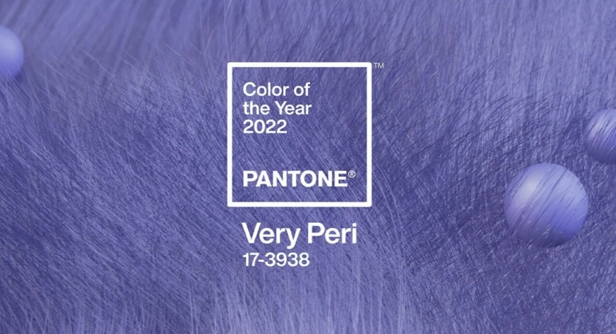
Today’s lifestyle, with the explosive growth of communication in ZOOM, media entertainment, the popularity of the NFT, and the relentless talk of the metaverse, provides a feeling of a new technological and Culture Revolution. We live in an era of changes and this is the main reason why Pantone Color of the Year 2022 is Very Peri or Pantone 17-3938.
Showing the carefree confidence and bold curiosity that fuel our creative ambitions, Very Peri color seems to help us embrace a changing world of possibilities. According to Pantone, this color represents the future in a new light and there is no shade of something artificial at the same time. This color can also be found in nature, for example, the periwinkle flower, which is a deciduous and evergreen perennial semi-shrub or herbaceous plant. We can already see this bright color in various industries, beginning with wallpapers in Windows 11 to high-tech mountain bikes S-Works, as well as on the podium of Louis Vuitton’s spring-summer collection of 2022.

Pantone color of the year Very Peri become an actual symbol of the global spirit of the time and all the issues that we are all going through at the time. As the entire world goes into temporary lockdown, we get our habits and standards to change. Physical and digital lives are merging into something new. The design helps us push the boundaries of reality by opening doors to a dynamically evolving digital world, enabling us to create and explore new possibilities. Pantone’s Very Peri color of the year images the flow of our day’s life and how color trends in the digital world manifest themselves in the physical world and on the contrary., The vice president of the Pantone Color Institute Lorrie Pressman puts it: “The colors we observe in technology have a bigger impact on design”. Thus, when they felt the world was transforming, they realized it was the best way for them to capture the collective mood and step into the unknown. Therefore, transforming the whole process of work and creating a new color that truly reflects this unique cultural moment, Pantone approached the choice of color exploring global trends in fashion, goods, art, and so on. But for the first time since the launch of the Color of the Year program in 2000, the company has actually created a new color rather than taking something that already exists from their signature library of shades. Lori Pressman, who sees the program as a social imprint, says that the decision reflects society's adaptation and changing ways of working during the pandemic. And she also noticed that we can not predict what each new day holds for us, therefore we need energy and courage to overcome everything that lies ahead of us. Thus, the color of the year Very Peri combines blue, which is considered reliable, with the addition of a violet-red hue, which gives a little cheerfulness and vivacity.
He started his career as a professional photo designer and retoucher. Professional commercial photographer with 20 years of experience. He is a leading advertising photographer and has worked as a food photographer with Michelin-starred chefs. His work with models can be seen on the calendars of many leading companies in Ukraine. He was the owner of the photo studio and photo school "Happy Duck".