


Shutter Speed Photography
Feb 19, 2019
Looking at the photo, we do not often ask ourselves what makes us so intently examine certain pictures. Perhaps this is a combination of certain colors? Or maybe the composition of objects is well-chosen? Today we're going to break down what color theory is and its application to photography and art.

To clarify how the basics of color theory were formed, we need to travel back in time to its origins.
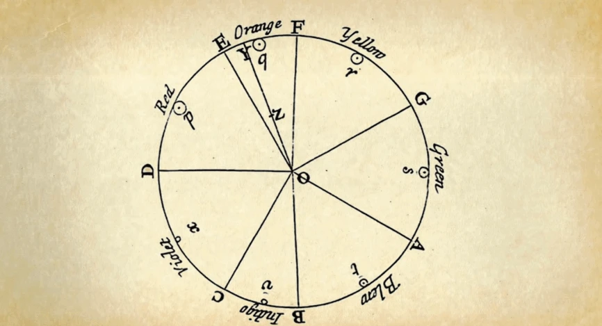
The beginning was laid in the distant 17th century by Isaac Newton. The Scientist is known for many discoveries. One of which was the invention of the color wheel. It was opened by Newton by means of transmitting light from a slit in a door through a prism onto a canvas. Thus, he received the red, yellow, and blue colors. Stated colors later became known as primary colors in photography, in a line with other kinds of arts. Secondary colors can be obtained as shades of the primary color, the same as tertiary colors
It is mostly accepted by humans that color represents darkness and light. The German writer J. W. Goethe thought the same. If Newton introduced the color wheel into use, then Goethe created the concept of perceiving different colors to suit the mood.
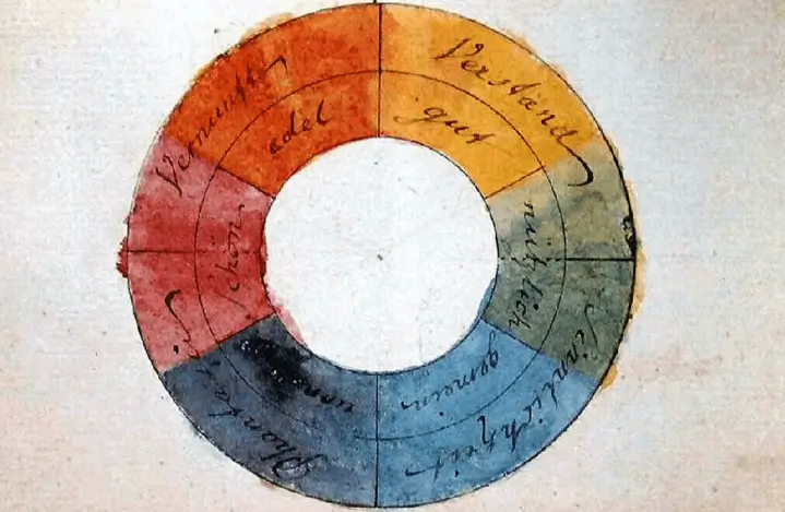
If we take a look at Goethe's concept, we can see that he marked the area of yellow as “gut” which translates as “good”. This is explained by the fact that Goethe unified yellow color with the sun because sunshine usually provides good emotions. That was the 2nd step in photography color theory evolution.
Goethe’s concept of perceived color as a kind of mood was adopted by Johannes Itten, a Swiss painter. He developed this theory further and clarified the concept of color harmony in his works.

This concept is still used nowadays, but let's take a closer look at how it became a reality.
In the 18th century, German painter Jacob Christoph LeBlanc introduced the concept of three-color printing. The essence of the concept is that by combining red with blue and yellow, as the three main colors of the traditional color wheel, we can get a complete picture. However, the combination of only these colors did not give appropriate dark shades, they were not sufficiently pronounced in the work. Therefore, the concept eventually evolved to a four-color, where black took its place.

An interesting fact is that all this ultimately helped to save on dyes of other colors.
Thus, the RYB color model became the abbreviation RYBK, where “K” refers to black. This is because “B” was already occupied by the blue as the starting letter of the color, and the abbreviation “K” was used by understanding as a key one for aligning the other three colors. In this way, confusion was avoided. Subsequently, both blue and red inks were changed to a process- blue, which allowed for more variety of tones.

Eventually, the ink color has been changed but not its name.

If we take a closer look at ‘Process’ blue, we will notice that in fact, it is cyan. In the middle of the 20th century, this color was called blue-red because of this. And the concept of cyan and magenta appeared later.

Nowadays, with all displays and monitors around, red, blue, and green have become the main colors for photography. This is due to the fact that the human eye has light-sensitive cones on the retina, just the same, corresponding to a given color representation.

But how does color work? The paper itself is white and thus reflects any light falling on it. Therefore, in the summer we try to dress in light-colored clothes to not get too warm. If we put ink on paper, this way we subtract a certain ink color from the white. This gave rise to the subtractive CMYK color scheme. This scheme is commonly used for printing on paper.
But unlike paper, we see colors on the display by combining them into compositions.
Let us look at a specific example using Photoshop. If we use a black background and apply a red stroke on it, and blue on top of the red and then change blending mode to ‘screen’, we will thus get a violet color. And if you go further and add green on top of these two, the color combination will give us white in blend mode.
Thus, RGB is an additive color system, unlike subtractive CMYK.
Having a better understanding of how the RGB system works, we can both create a drawing based on primary colors and split an already obtained drawing into the same color components. You can see that even the gradient of white and black is also made of the same red, green and blue colors. But this color model is the complete opposite of CMYK in its essence.
 If we do color correction in Photoshop, we need to keep the color wheel in our minds to know the opposites.

The CMYK color wheel is basically the same as the RGB color wheel, the difference is the method (subtraction/addition) CMYK just predates RGB on its appearance. Then what method is it better to use to get a good color harmony?
It appears the way we perceive color is more complex and requires more apprehension of how color works. We can use any color wheel as just a guideline to determine the use of the color palette.
It is very important to understand that there is also such a color feature known as ‘value’, besides the color palette. Those are:
HUE, saturation, and brightness (lightness) are working together.
HUE is a pure color with Brightness and Saturation values set to 100%.
The HUE is actually the name of the color, thus Red, Blue, Green, Orange are HUE variations.
HUE produces different colors by tinting and shading.

Tinting is when we add some white to the main color. Any whiter color than the original hue will become its tint.
Shading is kinda the opposite of tinting, in that case, we add some black to the original color. Adding some value of the black can provide different shading intensity.
To be able to tone the image or color, we need to add gray value to it.
Using different tonality values, we can desaturate the original hue.
Saturation itself is also called chroma. Saturated colors are more pure and intense. Desaturating the color, we make it closer to a neutral gray. We can also use the complementary color of gray for that with the RGB color space.
Brightness is the way how light or dark we perceive color.
A very common mistake is to mess up the brightness with luminosity.

Luminosity has clear boundaries from black to white through the grayscale.
If we draw two circles, one yellow and the other one is blue, and put them right next to each other, then at the same 100% brightness, the yellow circle will stand out and appear brighter. This is happening due to the fact that yellow is closer to the white area. If you open the color plate of both of these circles, then in both colors their brightness will be at the level of 100%, but the luminosity will be the difference. The blue circle will have this value at around 30%, and the yellow circle would be closer to 100%. The human eye perceives brightness differently from luminosity. This is because our eyes perceive their brightness to be different, which is shown in the luminosity.
The brightness and saturation of a hue are both controlling the luminosity.
That we can see in the color picker as we move the set hue to the left or to the bottom.

The concept of color harmony can be defined as a pleasant color combination for the viewer’s eye. This can create a different mood and evoke different feelings in relation to the photo. All of this lies at the heart of color theory photography.
Acknowledging color balance and colors relationships in general, we are able to distribute a variety of color schemes to use as a guideline. These schemes are based on a color wheel.

There are a variety of color schemes used in arts and design.
The list of most common schemes :
Let us take a look at its use with examples on some fashion and interior.
Monochromatic color scheme.

Monochromatic colors come up in shades of a single color. To implement that scheme, we need to increase black, white, or gray values to a single hue. Thus, images with the use of a monochromatic scheme will distract the viewer less and make him focus on the main theme.
Complementary color scheme.

Those colors are placed opposite to each other if we take a look at the color wheel. That can produce a striking color contrast.
Analogous color scheme

Analogous colors is a composition of three nearby colors. That constitution creates a calm viewing experience since the colors do not have such contrast or tension as complementary colors. Each color provides pretty much the same value.
Triad color scheme

The triadic color scheme capitalizes mainly three proportionally spaced colors. It produces the points of a triangle. The red, yellow, and blue color combination is a good example for that matter.
Tetrad color scheme
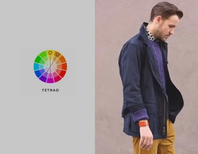
Tetradic colors is a variety of dual colors that contains two complementary pairs ranging equally in the form of a rectangle. There is usually no key color in that combination that may detract the viewer.
Square color scheme
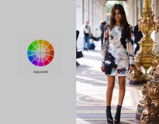
This scheme has four proportionally spaced complementary colors at the wheel. It has emphasized colors and shifting contrast.
Split Complementary color scheme
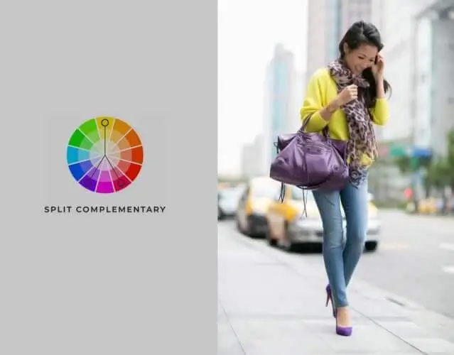
The scheme includes a key color plus two additional colors side by side as its direct complementary.
The color weight is a feature that makes your color palette have a sort of cohesion. It is not less important to grasp this concept the same way as any of the others.
The same way colors can have a temperature, they can also have weight.
The size and proportions of an object control the weight in a line with its luminosity.
Let us imagine that we have two squares: the 1st one is big, and another one is small. Both squares are black. By that, we know that the 1st square is heavier because of its size. If the bigger square gets some light red tint and the small one will have a dark red shade, then the small one appears to be heavier because the big one has become more transparent.
If both squares are at the same size and have just a different hue, their weight difference is not so obvious. To figure out, we need to check their Luminosity values in Photoshop color picker.
With that information, we can control the direction of how the viewer will perceive our image. That way we can use opposites, like a blue object as foreground and the yellow to blue gradient sky as the background, that will provide a certain atmosphere and viewing experience.

We can also use one key or dominant color. A dominant color will fight for the space on the picture, meanwhile, blend colors will have a good usage for a transition on the background.
Color theory is not only useful for artists or designers. It is equally important for photographers and retouchers, who usually use it simultaneously. The color concept should be used right from the pre-production stage, in other cases, the retouchers can improve the colors by pushing the neutral Gray’s to its complementary tints and shades for better transitions. Color balance or harmony is like a philosophy of the image, the more you know about it, the wiser it looks.
He started his career as a professional photo designer and retoucher. Professional commercial photographer with 20 years of experience. He is a leading advertising photographer and has worked as a food photographer with Michelin-starred chefs. His work with models can be seen on the calendars of many leading companies in Ukraine. He was the owner of the photo studio and photo school "Happy Duck".