
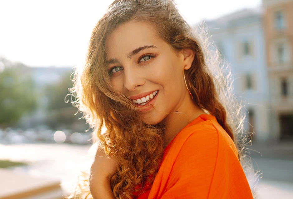


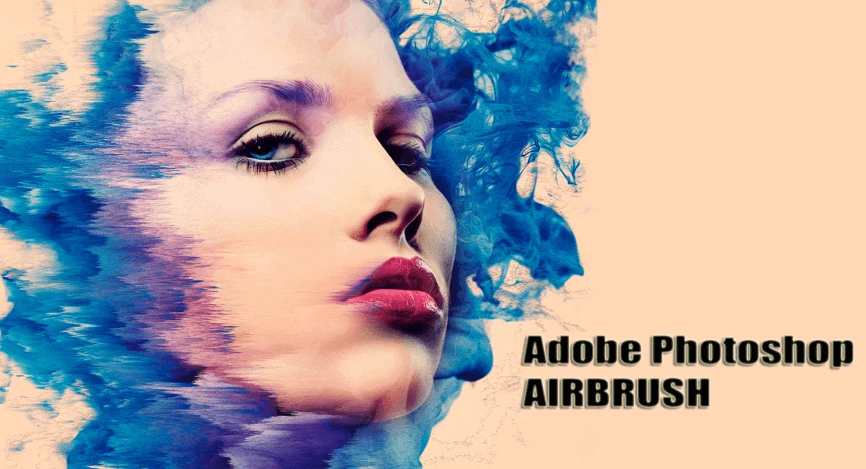
How to airbrush a photo in few taps
Apr 13, 2022
To understand what is value in photography we need to understand what color consists of.
The color has lots of divisions to evaluate the image. Those divisions are mostly represented as hue, saturation, contrast, exposure, white balance, and color temperature.
Each value has its own meaning for photography. Manipulating certain values will get different perceptions and effects to an image conveying different moods and styles.
So let us discuss how different values work in photography.
Firstly, value refers to light and dark. We see and interpret objects as three-dimensional because of the contrasts between areas of light and dark.
Photography translates to “drawing with light” and photographers use light in many ways. Value is commonly referred to in terms of black, white, and gray tones.
However, value is related to light. So the same terms can be used when discussing color. For example, pink, crimson, maroon are all values of red that are just darker or lighter.

To define value in photography we can take all the colors out of a photo turning an image into black and white but then we can still see and recognize the object that is being depicted. We can define different values in an image and compare them to grayscale.
Artists use these scales going from black to white to help them find or establish specific values in their artwork. Breaking down the variety of values in an image can give you a sense of its value changes. All colors have a similar scale ranging from dark to light.
Photographers can use value to create a focal point or an area of importance in artwork by emphasizing either light or darker values. Light values also called tints are made by adding white to a hue and dark values called shades do have more black added.
Value contrast is the difference between these light and dark values. The further apart the values are on the scale the more value contrast. Values next to each other have the least value contrast. Here we represent some examples of value in photography via contrast value usage.
Hight key artworks contain very little value contrasts. They might have little to no dark shadows and they might use mostly light values.

While low-key artworks can have very striking contrasts usually with lots of dark tones and lots and lots of shadows.

Using high or low-key values helps create different moods within your work.
Texture can also affect how we perceive value. Changes in values help us feel different textures by showing us how light reacts when it hits the subject matter creating both highlights and shadows in an image.
Images that show deep space such as landscapes and cityscapes show a type of value change called ‘atmospheric perspective’ in which objects get lighter in value and hazier as they move farther away from the viewer.
So use the element of value to create emphasis, to add some variety, or to convey a mood in your photography.

Exposure is another major element of value in photography.
Let us talk about exposure for the example of the camera shooting settings to clarify the value.
Exposure is the total amount of light that you capture and record when taking a photograph. You control your exposure through your ISO, aperture, and shutter speed settings which physically control how much light is able to enter the camera to be captured.
Generally speaking, when we are choosing the settings listed above, we are working to get the exposure indicator zero. We are doing that because the exposure indicator is connected to the camera’s meter and the meter is the camera’s brain. The meter reads the light in the scene calculating the average brightness of that scene. And the goal of the camera meter is for that average brightness to be 50 percent. A scene that meters to an average brightness of 50% will be considered as a well-exposed photo.

The exposure is how much light we capture and the value of that is tied to the camera meter and how it evaluates the scene. That value is expressed as a number on the positive and negative scale of the exposure indicator.
In some scenes, you also want to overexpose or underexpose the frame. But for that matter, it is important to consider the positives and negatives of the scene. Let us say we are photographing snow, overexposing the scene will provide nothing but a blended image because the scene is already naturally bright. Also if you will do portrait photography in sunny weather the light might smear outlines and make them less emphasized in the frame.
The value in photography elements such as temperature also has its use.
Every light source has a specific color temperature. Lights vary from orange tones to blue ones. We measure the color temperature of a light source in Kelvins.
Candles have a color temperature of around 1900 Kelvins while apartment light bulbs are around 3000 kelvins. These two light sources are on the lower end of the Kelvin scale and look orange. Daylight at midday is at around 5600 K and it appears white. Depending on the time of the day the daylight changes color temperature during golden hours it will be slightly more orange, during blue hours it will be cooler. Weather conditions also affect the color temperature. A cloudy sky can have as a high color temperature as 10 000 K.

Now as we understand the color temperature, what is white balance, and how are both of them connected? It is simply telling the camera what color temperature you want to see as white. Our eyes can not see certain sources as white: flames, for example, will always appear yellow and orange. A camera’s white balance is only limited by its setting and can see any color temperature as white. Once you have chosen the value for the white balance, any shade above that setting will be seen as cool and any shade below it will be warm.
If we shoot the candle whose color temperature is at around 1900 K but the camera’s white balance setting is 5600 K, since 1900 K is below the white balance setting, the candle will have a warm shade. And if we equalize the white balance setting with the light source temperature it will become cooler. That is the idea behind the white balance: if you make it lower, the candle will appear cooler and if we change it for a much higher setting, it will be much more orange. Playing around with white balance can be very useful if you want to create a peculiar ambiance of feeling to a scene. It can also be useful if you are limited in your choice of light sources. What if you have lights that only lit up at 5600 K but you want to give a warm look to the scene: change the white balance to 6000 Kelvins or above and your scene will now be lit by warm light. White balance lets you decide what will look better for the project you are shooting. But it is advised to be careful with this setting because if you overuse white balance, there could be two different light sources in your frame that will not match the same setting and it may not look realistic. To prevent that, consider all light sources around and their temperatures to establish the best shooting conditions and settings for your photography. If you want to manipulate the light source’s warmness without digital intervention, you may use different color filters to cover up the light sources in your scene with a specific color.

Hues are all the basic primary and secondary colors that make up the rainbow. They are the colors that makeup light, they are just wavelengths of white light. The primaries, yellow, red, and blue are made up in the transitions of those primaries - the secondaries. The secondaries are a mixture of two of the primaries being orange, purple, and green. All of these colors can be represented as a wheel.

The wheel allows us to understand the balance of color. Artists and designers can use harmonious color derived from theories about this color view. The most important thing to know about the color wheel is what colors are opposite each other. These opposite colors contrast each other and are also called complementary colors. Tertiary colors are made of three primary colors. Tertiary colors are not represented on the outside of the color wheel. But what we are able to do is to identify where in the color wheel a tertiary color hue lies.
For example, the brown color can be placed just in between orange and red.
Saturation is about how pure the hue is. To understand what is the saturation we need to be able to desaturate the hue wheel. By that, we need to add a complimentary color to an actual color in order to desaturate it. Adding complementary color decreases the purity. That way we can manipulate colors to achieve different perceptions.
Now we have a better understanding of the definition of value in photography.
The theory behind it can teach us how to correctly adjust your settings no matter if you are taking photos or adjusting colors in photoshop. The principle is the same, the difference is what buttons we press.
Co-founder of RetouchMe. In addition to business, he is passionate about travel photography and videography. His photos can be viewed on Instagram (over 1 million followers), and his films can be found on his YouTube channel.
Moreover, his profile is featured on the most popular and authoritative resource in the film industry — IMDb. He has received 51 international awards and 18 nominations at film festivals worldwide.


