


Difference Between JPEG and PNG
Dec 20, 2021
Every art requires deep, almost scientific examination of each detail. In order to understand what is contrast in photography, there is a simple task to do:
Photographer needs to ensure that there are eye catching elements which make the difference between original snapshot and final result. And still it is important to know the value of mistake considering on high contrast vs. low contrast. Shooting style and idea is going to help you. Because various shooting modes have own way to be processed and improved afterwards. Brightness and sharpness of image elements will definitely depend on skills and professionalism of the artist, as well as software, used for its processing.
There are many ways to demonstrate specific characteristics of every single item on the picture. It is essential if you are looking for additional emotions in your album.

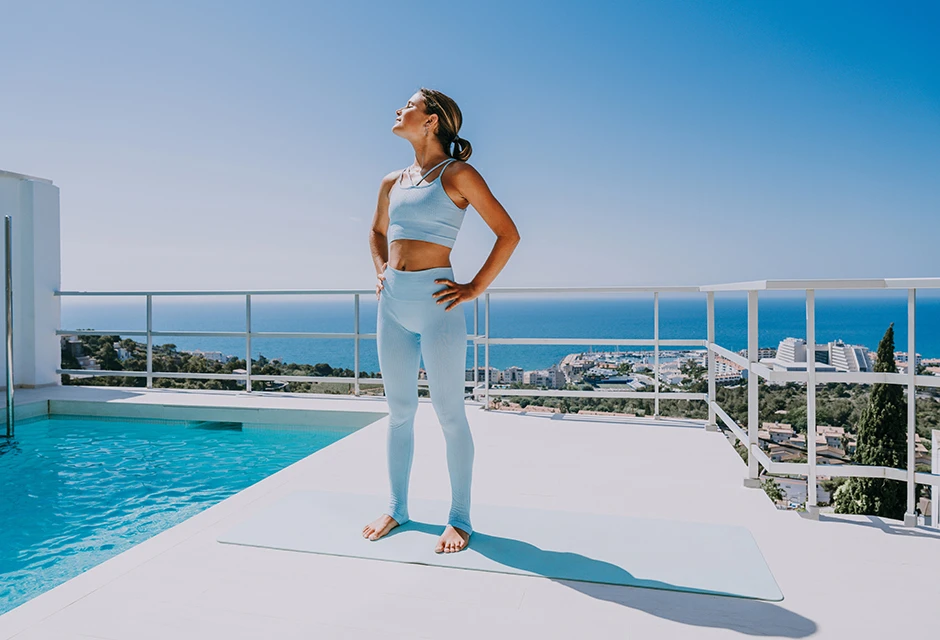
When we go outdoors and enjoy bright sunlight, it is easy to find an object or composition perfectly lit up from all the angles. Nature helps us to memorize the moment in its ideal weather conditions. That is why colors of such a picture usually pop-up on the screen with boldness. This is a great opportunity to learn all variety of shades and tones, shadows and highlights, owing to a high “contrasty” of every shot. Its deep and attractive effect makes us think that every picture needs something more to “explode”.

Looking for perfection, sometimes we forget about ideal composition which does not require artificial touch. Magic dreaming with fantastic landscape is a great example of low contrast picture. Still, there are some options as well. High-key pics are characterised with a number of brighter tones, and low-key image does not need exaggerate attention to differ its shades. Think about the plot of every shot to understand post-processing work.Though certain images help you to decide on necessary tool to apply, there is always an easy application which assists in choosing right settings for each shot. Decreasing highlights or increasing shadows will show you the way on achieving the best result. Try various options on the same image and you will immediately see the difference in emotions.


Every color has its difference according to the lighting from the most bright to the darkest. It corresponds to tone contrast definition. Photography with achromatic colors is always in fashion. Amateurs and professionals look for additional tools to add expression to objects on a picture without vivid colors. Achromatic colors are shades of gray from light white to a total black.

Emotional expressiveness of every achromatic composition depends on the scale of tones used in it. The composition with light gray tones, will look light, airy and peaceful.
If the shot looks gloomy or even tragic, then darker shades were used. The strongest, dynamic and harsh combination is considered to be black and white union. It is known as an old school classic example, which does not require any accessory or hard post-processing work. This is natural retouching tool, which usually helps every newbie in this creative art.

This game of shades is mostly used in a mode of intentional darkening of the foreground and highlighting the background. Or vice versa. Such photos create the so-called tonal perspective. Possibility to change color of objects after they are captured by the camera. The effect becomes more visible when items closer to the camera are in blue shades.
With the help of such a high contrast photography, it is easier to depict silhouettes of people. Because the body of a person in the frame is located on a bright, well-lit backdrop. The viewer's attention is always attracted by objects, which illumination differs significantly from other items in the frame. A perfect silhouette is obtained if there is a sufficiently large difference in illumination. For example, it happens during the shooting against bright windows. This small but useful tip is an easy and low-cost mode to practice various shooting styles.

This specific approach implies the presence of opposite colors in pictures. And if it is used correctly, then the image immediately catches the eye of every single viewer. These tools were discovered by famous painters and scientists, who had studied a number of ways to influence human’s emotions with visual aids.
Competing colors are easily identified using a simple wheel. If the linear spectrum of the light beam, consisting of 7 basic (red, orange, yellow, green, blue, blue, violet) and 5 transitional colors, is located around the circumference, we get a perfect wheel.

Many samples of such tone choices are widely used by experts all over the world, in fashion, design, etc.
Yellow and blue, red and green represent those matching options, which will definitely work good for your picture and eyes.
Classic triad of shades is located on the vertex triangles of a circle. Three classic options (orange, lilac, green) are considered the most well-known.
TIP: The saturation should also be different, depending on shade. Only accurate work will provide a harmonious picture, pleasing eyes.
If you want to create a feeling of comfort and peace, use tomes that are located next to each other with shades in a circle. Nature has created such a harmony and everything that is natural is absolutely amazing. Nice looking gradients create an overall rainbow-colored picture.
All colors are divided into warm and cold tones. Shades of red, yellow, green can be attributed to warm, and shades of violet and blue — to cold.

What is the right solution for objects of the same color? In this case, you can use a variety of textures and patterns. How to find a perfect combination and emphasize for every single pattern? Let us learn three basic texture types:
Here the rule is simple: greater difference in the texture of objects — better emphasis of these objects on the picture.
This is a great opportunity to highlight any of the desired elements. Also this kind of tool is good to use if you need to draw the viewer's attention to a characteristic feature. In addition, it is a great opportunity to select each element of the image, if colors are similar.

One of the most fascinating things of modern photography is a possibility to capture every movement from slow passes to flash light speed. Here the most important thing is to convey the movement, each action should be perfectly captured. For example, a car moving across trees or fields, a skier doing a turn or jumping from a springboard. Uniting static and dynamic action is not such an easy task. But if you managed to achieve such a result, it means you are close to success. Such images stand out favorably. This is due to the fact that “catching” the movement is not easy, and in order to get a good shot you need to practice a lot, experimenting with settings of shutter speed. Usually low contrast photos are obtained exactly after attempts to capture a motion. Blur effect is the biggest enemy in such cases.

Perhaps this is the most difficult tool for even the most experienced artist. Its essence lies in a wise composition of items in the same image. Those objects may not have a similar significance, but at the same time they form a whole plot, where one without the other does not make sense. Such pictures should always be very carefully thought out. In this case, it is necessary to carefully approach the composition. It is better when the emphasis is present on both semantic centers, while the minor details should not distract the viewer's attention. Semantic unions are usually used in genre photography.
Such pictures may be just a lucky shot and a successful coincidence of circumstances when the camera turns out to be in the right place and at the right time. But in order not to lose such a magnificent opportunity, it is recommended to learn composition rules and notice every detail in time.
Semantic approach is a highly professional feature and does not permit mistakes of low contrast photography. Because this genre is mostly used in advertising. It is an opposition of two plots, often with completely incompatible images that carry a certain sense. Such images may contain completely "crazy" ideas, limited only by imagination of the person who invents them.

Summing up the importance of the above mentioned topic, it is necessary to clearly understand the plot and demonstration modes. Technical digital settings and post-processing software is not the only significant detail. Smart work organization and eye on composition will contribute to a successful result.
When all settings correspond to the mood of the scene, everything that you have to do is to choose the best angle for shooting. Correct snapshot is 95% of a successful result. This is like a cold fresh drink on a hot summer day. All ingredients are available, only a professional bartender is missing, who is going to mix it all together.Each image can benefit from: correctly chosen shooting time (light), right selection of elements in a composition, choice of elements, which can be processed and over or underexposed.
Try it, experiment and do not forget that every picture can include one or more techniques.
He started his career as a professional photo designer and retoucher. Professional commercial photographer with 20 years of experience. He is a leading advertising photographer and has worked as a food photographer with Michelin-starred chefs. His work with models can be seen on the calendars of many leading companies in Ukraine. He was the owner of the photo studio and photo school "Happy Duck".


