


Reflection Photography Ideas
May 23, 2024
Have you ever wondered how some artists are able to find perfect color combinations that just seem to work every time? It is not just art, it is science which is called color theory. There are many techniques behind this theory to give your photos a more natural look, especially if you are working with a lot of assets in Photoshop and the colors don't match or look inconsistent catching your eye and making the photos look bad. Today we will discuss color theory, how to put this knowledge into practice, and how to match photo colors in Photoshop.
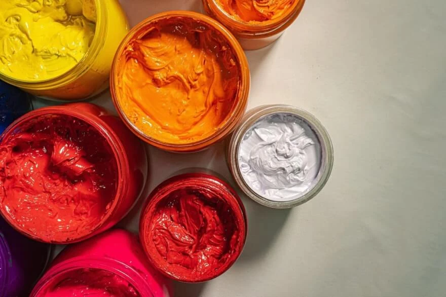
Most people are familiar with such terms as color wheel and color harmony and are made to choose color combinations that are appealing, cohesive, and just look great. Using color harmony, you can evoke certain emotions, create a mood, or add context to your images. When you do not use color harmony your art may appear blend and boring or so chaotic that your brain can’t process it properly.
Back at school, we learned about primary, secondary, and tertiary colors. We were taught that the primary colors are red, blue, and yellow. When mixed together these make the secondary colors green, orange, and purple. Take it a step further you will get the tertiary colors yellow-green, red-orange, and so on.
These make up the traditional color wheel that was created by Sir Isaac Newton and help us understand how different colors work together. 
The traditional RYB color wheel is no longer the only color wheel that exists: CMY, and RGB, are used by artists and designers to create a bigger range of colors when mixed together. These color wheels are important, but when choosing color combinations the traditional color wheel is still our best resource for understanding color harmony and how colors work together to create beautiful art.

There are 4 main qualities of each color on our wheel. The first is HUE which is simply the color position around the wheel and the brightest, purest version of each color containing lighting values maxed out.

This color wheel (RYB) has 12 colors, but we can also use all of the hues in between.
Another value is saturation, this is also known as intensity or chroma. This tells us how vibrant a color is. A desaturated color is grayed out and dull, while a saturated color is vibrant and strong.

There we have value. This tells us how dark or light a color is. We can create shades of color by adding black or tints of our color by adding white. We can also add tone by ading gray.

And finally, we have color temperature. A color wheel could be split into two main groups:
But individual colors can also change in temperature as we move around our wheel. A warm red includes more yellow and a cool red includes more blue becoming purple. When we combine HUE, Saturation, Value, and Temperature we find ourselves with a myriad of variations of each of our twelve main colors. So how do we use all these colors together and how to match colors in Photoshop? We can use our twelve basic hues on the color wheel, along with some easy-to-follow formulas to create an endless collection of color combinations that look balanced appealing, and just work. These formulas are known as color harmonies.
The first and easiest formula is a monochromatic color harmony. This takes just one base color or hue from our wheel and uses different shades, tones, or tints to create a group of colors. It is one of the easiest color harmonies to create and looks simple, cohesive, and organized. 
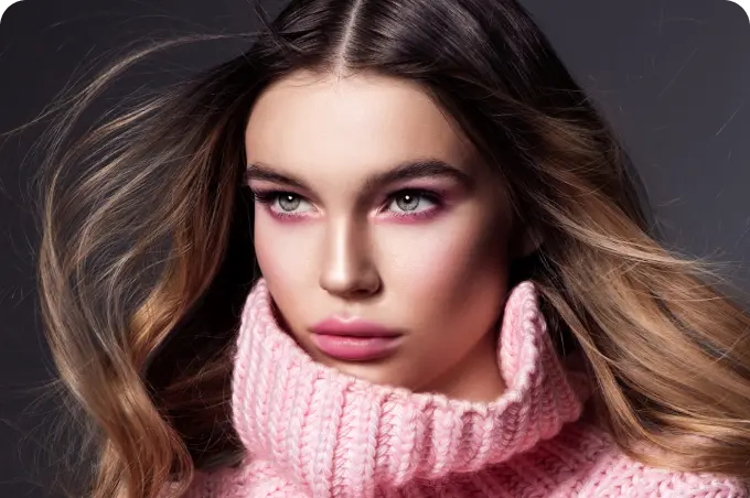
This color wheel is a how-to match skin tones in Photoshop or the face color as the skin tone is not as significant. However, it still requires matching with its surroundings by adjusting its tone or tint depending on lightning and other conditions the photo was taken on.
Next, we have a complementary color scheme. This takes two colors from opposite sides of the color wheel, such as red and green or blue and orange.

This type of color scheme is great for creating strong contrast in the image you are working on in Photoshop. Use this scheme to emphasize a story highlighting parts of the image to assert a certain mood or atmosphere.
A split complementary color scheme is similar to the previous color scheme, except one of the colors is split into two nearby colors. This keeps the high contrast of the complementary color scheme but also adds more variety.

This we use in cases where we need three-color combinations taken from our wardrobe to make our clothes look harmonic in combination which you can also adjust in post.
There are also tetradic colors, triadic colors, and analogous colors which you can learn more about in this article.
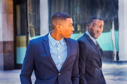
Let us now get into Photoshop and see particular examples of how we use its comprehensive interface and what adjustments are to be done to get a perfect image having two assets.

So, how to color-match 2 images in Photoshop if we have our main subject placed on a certain background to obtain a pleasing look? The reason images may look so different from each other is that we have two different lighting conditions shots and that lighting adds more value to one and less value to another and we need to balance this out via color correction.

Let us say we have our main subject photographed on a beach during sunset and we want to place it on to mountains background. The 1st thing that comes to mind is that the subject photo asset contains warm colors and we want to put it on some “cold” background which gives us a hint of color temperatures.

As we have our subject cut and placed on this background, add a layer mask of that selection (when it is active) and then go to the adjustment layer ![]() and choose curves.
and choose curves.

When in the curve’s interface, select this icon ![]() to only affect the layer below. Go to the properties tab where we see the curve and click on that icon
to only affect the layer below. Go to the properties tab where we see the curve and click on that icon ![]() to set the ‘Auto Options’ from there. In Auto color correction options check the ‘Find Dark & Light Colors and uncheck the ‘Snap Neutral Midtones’. Then click on shadows in the ‘Target Colors & Clipping’, and by using the color finder tool, click on the darkest area of the background. Repeat the same with the brightest area.
to set the ‘Auto Options’ from there. In Auto color correction options check the ‘Find Dark & Light Colors and uncheck the ‘Snap Neutral Midtones’. Then click on shadows in the ‘Target Colors & Clipping’, and by using the color finder tool, click on the darkest area of the background. Repeat the same with the brightest area.

Now go back to layers and choose the layer with color curves, go above into blending options, and choose ‘Color’ from there.

So, this is how to match the lighting in Photoshop for the background and subject. You can compare before and after. As you can see, the skin and overall subject image match the lighting better.
If you want to go any further and match brightness between the assets you can add another adjustment layer for the ‘Color Lookup’ and select 3d lut for ‘Crisp_winter.look’. Now go back to blending options and click on the ‘Soft light’. Adjust the fill to make the overall image look nice and smooth as it may appear a bit oversaturated with that loot.

Check the before and after and see if you are pleased with the results you have gotten.
Now we know how to match skin color in Photoshop, brightness, and colors depending on lighting between certain assets, and the color theory behind all of these.

The color cropping editor takes time and effort to learn and even slightly get good at it. Practicing is the key, having color theory and harmony to back you up, all you need to do is comprehend the complex Adobe Photoshop interface or simply use our Professional retouching service. It allows you to get a professional retouching over your photos that you wish to look better in terms of color matching, skin tone, and basically any other photo adjustments. Our service is available for millions of people, if you have no time to waste in Photoshop or Lightroom on your own, RetouchMe is at your service.
Co-founder of RetouchMe. In addition to business, he is passionate about travel photography and videography. His photos can be viewed on Instagram (over 1 million followers), and his films can be found on his YouTube channel.
Moreover, his profile is featured on the most popular and authoritative resource in the film industry — IMDb. He has received 51 international awards and 18 nominations at film festivals worldwide.